George Baxter
ID Number: 50560813
Digital Print & Communications 60151
FMP Magazine
Changes made
<--- View it here
Reflection:
My overall view on my FMP magazine is that it went so well it looked better then my last magazine I made because I have gained more knowledge into the layout of an magazine and designing and with learning more knowledge I used it towards my magazine so I can make it look like a proper magazine and the way I have designed stuff throughout my magazine was very simple but it has a meaning towards my topic and genre I went for, what went well for me wit creating this piece of work is that I took my time with the designing so it doesn’t look rushed I wanted it to look like it took time, the articles I wrote and have included throughout my magazine all suit the purpose of my magazine and the recipes I got from my primary research really helped as I found stuff that are quite similar to the answers I got from questionnaire and also that I got everything done in a specific time frame I set myself so I could then get feedback from others to see where I could improve and what I could do better with my designs, so with getting the feedback I can use the feedback to make my magazine suit my audience as my audience will give me the feedback to my designs. What I could do better for next time is to get feedback after each design I finish so I wouldn’t have to go back over the designs and change them so I can put more time into other things to potentially boost up my grade for this project.
.png)
.png)
The changes I made to my front cover was that I added the name of the athlete in the corner to make sure people know who he is and I've used the colour of it from the background colour as it looks nice, I've also put it over the main image as you can still see what he is doing or wearing and so it takes up most of the blank space, I also got feed back from this and the feedback was to add in the name of the athlete, as I saw another of this technic being used on another magazine front cover
.png)
With feedback from people ive had to get rid of the subheadings that were originally there before and taking on this advice it has made my front cover look better you can see my main image more clearly as it doesn't have random text over the main image.
.png)


I had to change one of my adverts as it was pretty simple and lazy so I changed it to a cheap shop which is very popular around the world due to how cheap their prices are and I also got feedback to use this shop as they are a big fan on it and it holds different cheap weeks also known as 'Pick of the week' so I used that to promote how cheap the fruit and veg they have in the shop and I wanted to promote healthy eating so using this popular shop will help.

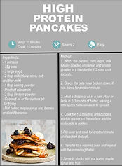
Having feedback on my recipe pages has really helped as they look better than before and just getting the insight of how to improve them makes much difference what I've had to change on my recipe pages is to make the background color a lighter grey as the dark grey didn't really suit the page that well and also I had to change how many steps there are to make these meals as only some of them had only 2 or 3 steps so just splitting them up into many more steps will make it easily more readable and hopefully make it more understandable of how you create these meals.
.png)
.png)
The kind of changes I made to this advert is that I added better quality photos of the fruit and the pick of the week photo as you can tell they are really bad quality photos and wouldn't look good so I had to change them so the advert looks better as a whole and I also added the Lidl catchphrase that they use in there own adverts.
.png)

The kind of changes I made to this advert that I added a real Qr code so the audience can scan it and it will send them to the actual website you can buy the products of the other key changes that I made were the images of the products as they were bad quality photos and with getting the images off of the actual restaurant has made the advert smoother and the other change I made was the title as it is in better quality and I've made it much bigger to see on the advert.
Charan's Feedback
Reflection
After receiving feedback from Charan I think it went well as we went through my website and my magazine as I didn't know how to improve my work and having feedback on my work I went back and improved what I needed to improve and then once I added the improvements I went back and asked for my feedback on the new things I added so I know it was perfect, but having feedback really helped with how I can improve my work and it gave me an insight on how my audience would like to see my magazine.